Difference between revisions of "OXP howto HUD"
Cholmondely (talk | contribs) m (Oops!) |
(Updating BB links) |
||
| (5 intermediate revisions by 2 users not shown) | |||
| Line 14: | Line 14: | ||
The first alternative HUDs were designed by Aegidian as examples of how to do it ([[CompactHUD]] & [[Mega-Walnut Dashboard OXP]]). A number of the early ships came with their own custom HUD (''eg''. [[Outrider]], [[Wolfwood Interstellar Technologies|Wolfwood's ships]], ''etc''.). | The first alternative HUDs were designed by Aegidian as examples of how to do it ([[CompactHUD]] & [[Mega-Walnut Dashboard OXP]]). A number of the early ships came with their own custom HUD (''eg''. [[Outrider]], [[Wolfwood Interstellar Technologies|Wolfwood's ships]], ''etc''.). | ||
| − | Early leading innovators included Wyvern ([[MilHUD]] (Military Specification HUD) - 2007-11) and Killer Wolf ([[Steampunk HUD]], [[Killer Wolf's Dynamic HUD]], [[Isis HUD]], and individual HUDs for his new ships). | + | Early leading innovators included CaptKev ([[Fighter HUD (Oolite)|Fighter HUD]]), Wyvern ([[MilHUD]] (Military Specification HUD) - 2007-11) and Killer Wolf ([[Steampunk HUD]], [[Killer Wolf's Dynamic HUD]], [[Isis HUD]], and individual HUDs for his new ships). |
Oolite v.1.74 (2010) added in the ability to recognise the state of alert (red/yellow/green) allowed the introduction of the "Dynamic HUD" which changed between the states - as well as the docked HUD. | Oolite v.1.74 (2010) added in the ability to recognise the state of alert (red/yellow/green) allowed the introduction of the "Dynamic HUD" which changed between the states - as well as the docked HUD. | ||
| − | Norby developed his [ | + | Design in this period was dominated by Wyvern & Killer Wolf, who were joined by Wildeblood ([[MilHUD 4000]], various intelligent crosshairs, [[Altimeter]], ''etc''.), CommonsenseOTB ([[Pie Chart Style HUDs]], [[Numeric Style HUDs]], [[ChupacabraHUD]], [[Sniper Camera System HUD]] and Captain Beatnik ([[CB-HUD Mark II]], [[Coluber HUD CH01]] ''etc''.) |
| + | |||
| + | Norby developed his [https://bb.oolite.space/viewtopic.php?f=4&t=14536 HUDRequests.oxp] in 2013 to drive improvements in the Vanilla Game's abilities to enable more complex HUDs for Oolite v.1.80. This helped lead to the introduction of [[MFD]]'s. | ||
And over the years more and more has been added: | And over the years more and more has been added: | ||
| − | |||
| − | |||
| − | |||
| + | '''Aesthetics''' | ||
*Choice of layouts/colour - [[Dangerous HUD]] (fighter cockpit view, hauler cockpit view and glass-only view, 6 colours) & [[Xenon HUD]] (2 colours) | *Choice of layouts/colour - [[Dangerous HUD]] (fighter cockpit view, hauler cockpit view and glass-only view, 6 colours) & [[Xenon HUD]] (2 colours) | ||
*Sound effects - see [[Dangerous HUD]] | *Sound effects - see [[Dangerous HUD]] | ||
| + | *Pulsating scanner - see [[Dangerous HUD]] | ||
| + | *Dials rather than progress bars - see [[Vimana HUD]] | ||
| + | *Pies rather than progress bars - see [[Pie Chart Style HUDs]] | ||
| + | |||
| + | '''Astrogation''' | ||
| + | *A [[Joysticks and Gamepads|precision indicator]] for Joysticks/Controllers | ||
| + | *Combining tilt indicator with the compass (''eg'' [[Coluber HUD CH01]]) | ||
*Current Location Display (with Current Risk Notifier) - see [[Deeper Space HUD]] | *Current Location Display (with Current Risk Notifier) - see [[Deeper Space HUD]] | ||
| + | *Warning signs for low altitude/energy/shields/high temperature - see [[Vimana HUD]] - very important for new players who might crash into planets! | ||
| + | *Sun glare contrast - see [[Xenon HUD]] | ||
| − | |||
| − | |||
| − | * | + | '''Equipment''' |
| + | *Equipment Lights (see [[Coluber HUD CH01]], [[Vimana HUD]] & [[Z-GrOovY MiLHUD]] (these do not seem to be interactive) | ||
| + | *Extra add-on modules (purchasable) with some of the functions of the Combat & Navigation MFD's - see [[Vimana HUD]] | ||
| + | *[[MFD]]'s - the older HUDs have none, the Vanilla game HUD has 2, other HUDs have from 4 - 12. | ||
| − | |||
| − | * | + | '''Combat''' |
| + | *A [[Target Reticle]] which clearly indicates when one is "on-target" with the laser | ||
| + | *Weapon Bays Missile Identifier - see [[ChupacabraHUD]] - there are now over [[:Category:Missiles & Bombs|30 different missile & bomb icons]] | ||
| + | *[[Shield Equalizer And Capacitors OXP|Shield Capacitors gauges]] - see [[ChupacabraHUD]] | ||
| + | *Dynamic HUD as mentioned above with a cleaner viewscreen for Red Alert, and vital indicators moved up to the laser crosshairs - see [[CombatHUD]] and many others | ||
| + | *Polarized sights for reducing sun glare | ||
| − | |||
| + | ---- | ||
== Important Links == | == Important Links == | ||
| − | * [ | + | * [https://bb.oolite.space/viewtopic.php?f=4&t=18444 Designing a HUD - without trial and error] (2016) - a few helpful notes |
* [[HUD images here]] - screen shots of some 40-odd HUD's (some are ''very'' odd!) for inspiration | * [[HUD images here]] - screen shots of some 40-odd HUD's (some are ''very'' odd!) for inspiration | ||
| Line 52: | Line 66: | ||
=== Other Links === | === Other Links === | ||
| − | *[ | + | *[https://bb.oolite.space/viewtopic.php?f=4&t=18766 (HUD Dev) drawCustomText: - multi line / line break possible?] (2017) |
| − | *[ | + | *[https://bb.oolite.space/viewtopic.php?f=4&t=18760 (HUD Dev) Display current system and tech level?] (2017) |
| − | *[ | + | *[https://bb.oolite.space/viewtopic.php?f=4&t=18754 (HUD Dev) Display speed in meters?] (2017) |
| − | *[ | + | *[https://bb.oolite.space/viewtopic.php?f=4&t=18406 A Vertical HUD?] (2016) |
| − | *[ | + | *[https://bb.oolite.space/viewtopic.php?f=4&t=13314#p192102 Issues with 2 HUDs loaded] (2013) |
| − | *[ | + | *[https://bb.oolite.space/viewtopic.php?f=4&t=16169 Thread includes some issues with designing HUDs] (2013) |
| − | *[ | + | *[https://bb.oolite.space/viewtopic.php?f=4&t=10880 Formatting text msgs on a HUD] (2011) |
| + | ---- | ||
== OXP compatibility == | == OXP compatibility == | ||
| − | *[[HUDSelector]] is the important one - and also allows the player to change the scanner resolutions. | + | *[[HUDSelector]] is ''the'' important one - and also allows the player to change the scanner resolutions. |
| + | |||
| + | :And note that [[HUD Selector]] also allows placement of ''extra'' dials if [[Combat MFD]] is loaded. | ||
| + | |||
| + | |||
| + | ---- | ||
| + | == Issues to consider == | ||
| + | *[[Immersion]] - Killer Wolf's docked HUDs are good examples of this | ||
| + | *And the MFD arrangement? Are there enough of them? Do they block out too much of the view? | ||
| + | *Is there an indicator for precision controller/joystick flying? | ||
| + | *Are low altitude/high temperature ''etc'' clearly indicated? | ||
| + | *What happens when one docks? Is there a docked version - or does it work with [[Docked HUDs]] if not? | ||
| + | *Are the viewscreen locations for broadcast messages and for console messages properly thought through? | ||
| + | *If there is a lengthy name appearing for ''eg'' the Compass setting, is there enough space for it (See the [[Nova Lux HUD]] for a failure) | ||
| + | *Is there enough space for the multiple energy banks of the larger ships? | ||
| + | |||
| + | === Combat === | ||
| + | *Does the HUD clearly indicate a state of red alert? Or of impending doom? | ||
| + | *Is the Red Alert/combat display comfortable - shields/energy levels/laser temperature - does it block one's view? | ||
| + | *Is the scanner big and visible enough? (See the [[Steampunk HUD]] where the ships beneath the scanner are occluded by the cockpit) | ||
| + | *Is there enough space for the multiple missile bays of the larger ships? | ||
| + | |||
| + | ---- | ||
| + | == MFD's == | ||
| + | The HUD oxp's themselves define what is possible in terms of MFDs - how many there are, and their position, size & colour. See for example the two versions of the [[Vimana HUD]] which are contained in the OXP and chosen by [[HUDSelector]] - Gnievmir's 6 MFD version has green MFD's, while Dybal's added-in 12 MFD version has blue MFD's! | ||
| + | |||
[[Category:Oolite]] [[Category:Factual]] [[Category:Oolite scripting]] | [[Category:Oolite]] [[Category:Factual]] [[Category:Oolite scripting]] | ||
Latest revision as of 08:36, 18 March 2024
This page is currently merely a collection of links with a little background
Contents
History
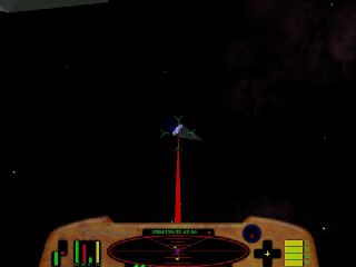
The first alternative HUDs were designed by Aegidian as examples of how to do it (CompactHUD & Mega-Walnut Dashboard OXP). A number of the early ships came with their own custom HUD (eg. Outrider, Wolfwood's ships, etc.).
Early leading innovators included CaptKev (Fighter HUD), Wyvern (MilHUD (Military Specification HUD) - 2007-11) and Killer Wolf (Steampunk HUD, Killer Wolf's Dynamic HUD, Isis HUD, and individual HUDs for his new ships).
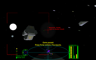
Oolite v.1.74 (2010) added in the ability to recognise the state of alert (red/yellow/green) allowed the introduction of the "Dynamic HUD" which changed between the states - as well as the docked HUD.
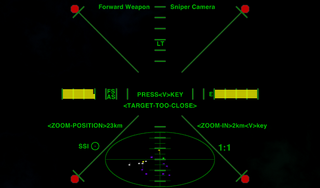
Design in this period was dominated by Wyvern & Killer Wolf, who were joined by Wildeblood (MilHUD 4000, various intelligent crosshairs, Altimeter, etc.), CommonsenseOTB (Pie Chart Style HUDs, Numeric Style HUDs, ChupacabraHUD, Sniper Camera System HUD and Captain Beatnik (CB-HUD Mark II, Coluber HUD CH01 etc.)
Norby developed his HUDRequests.oxp in 2013 to drive improvements in the Vanilla Game's abilities to enable more complex HUDs for Oolite v.1.80. This helped lead to the introduction of MFD's.
And over the years more and more has been added:
Aesthetics
- Choice of layouts/colour - Dangerous HUD (fighter cockpit view, hauler cockpit view and glass-only view, 6 colours) & Xenon HUD (2 colours)
- Sound effects - see Dangerous HUD
- Pulsating scanner - see Dangerous HUD
- Dials rather than progress bars - see Vimana HUD
- Pies rather than progress bars - see Pie Chart Style HUDs
Astrogation
- A precision indicator for Joysticks/Controllers
- Combining tilt indicator with the compass (eg Coluber HUD CH01)
- Current Location Display (with Current Risk Notifier) - see Deeper Space HUD
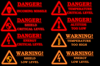
- Warning signs for low altitude/energy/shields/high temperature - see Vimana HUD - very important for new players who might crash into planets!
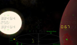
- Sun glare contrast - see Xenon HUD
Equipment
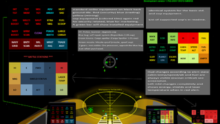
- Equipment Lights (see Coluber HUD CH01, Vimana HUD & Z-GrOovY MiLHUD (these do not seem to be interactive)
- Extra add-on modules (purchasable) with some of the functions of the Combat & Navigation MFD's - see Vimana HUD
- MFD's - the older HUDs have none, the Vanilla game HUD has 2, other HUDs have from 4 - 12.
Combat
- A Target Reticle which clearly indicates when one is "on-target" with the laser
- Weapon Bays Missile Identifier - see ChupacabraHUD - there are now over 30 different missile & bomb icons
- Shield Capacitors gauges - see ChupacabraHUD
- Dynamic HUD as mentioned above with a cleaner viewscreen for Red Alert, and vital indicators moved up to the laser crosshairs - see CombatHUD and many others
- Polarized sights for reducing sun glare
Important Links
- Designing a HUD - without trial and error (2016) - a few helpful notes
- HUD images here - screen shots of some 40-odd HUD's (some are very odd!) for inspiration
Crucial Reference
Other Links
- (HUD Dev) drawCustomText: - multi line / line break possible? (2017)
- (HUD Dev) Display current system and tech level? (2017)
- (HUD Dev) Display speed in meters? (2017)
- A Vertical HUD? (2016)
- Issues with 2 HUDs loaded (2013)
- Thread includes some issues with designing HUDs (2013)
- Formatting text msgs on a HUD (2011)
OXP compatibility
- HUDSelector is the important one - and also allows the player to change the scanner resolutions.
- And note that HUD Selector also allows placement of extra dials if Combat MFD is loaded.
Issues to consider
- Immersion - Killer Wolf's docked HUDs are good examples of this
- And the MFD arrangement? Are there enough of them? Do they block out too much of the view?
- Is there an indicator for precision controller/joystick flying?
- Are low altitude/high temperature etc clearly indicated?
- What happens when one docks? Is there a docked version - or does it work with Docked HUDs if not?
- Are the viewscreen locations for broadcast messages and for console messages properly thought through?
- If there is a lengthy name appearing for eg the Compass setting, is there enough space for it (See the Nova Lux HUD for a failure)
- Is there enough space for the multiple energy banks of the larger ships?
Combat
- Does the HUD clearly indicate a state of red alert? Or of impending doom?
- Is the Red Alert/combat display comfortable - shields/energy levels/laser temperature - does it block one's view?
- Is the scanner big and visible enough? (See the Steampunk HUD where the ships beneath the scanner are occluded by the cockpit)
- Is there enough space for the multiple missile bays of the larger ships?
MFD's
The HUD oxp's themselves define what is possible in terms of MFDs - how many there are, and their position, size & colour. See for example the two versions of the Vimana HUD which are contained in the OXP and chosen by HUDSelector - Gnievmir's 6 MFD version has green MFD's, while Dybal's added-in 12 MFD version has blue MFD's!
