Difference between revisions of "ClearHUD"
Cholmondely (talk | contribs) (Page Created) |
(Updating BB links) |
||
| (One intermediate revision by one other user not shown) | |||
| Line 96: | Line 96: | ||
This work is licensed under the Creative Commons Attribution-Noncommercial-Share Alike 3.0 Unported License. To view a copy of this license, visit http://creativecommons.org/licenses/by-nc-sa/3.0/ | This work is licensed under the Creative Commons Attribution-Noncommercial-Share Alike 3.0 Unported License. To view a copy of this license, visit http://creativecommons.org/licenses/by-nc-sa/3.0/ | ||
| + | |||
| + | == Tweaks == | ||
| + | *[https://bb.oolite.space/viewtopic.php?p=230554#p230554 Adds in 4 MFDs & other tweaks] by Venator Dha (2014) | ||
| + | |||
| + | You may wish to consult [[How to tweak OXZ's]] | ||
== Links == | == Links == | ||
| − | *[ | + | *[https://bb.oolite.space/viewtopic.php?f=4&t=12476 (Release) Clear HUD 1.3 and Sniper Sight for Clear HUD] 2012 |
{{HUD-OXP}} | {{HUD-OXP}} | ||
Latest revision as of 02:26, 29 February 2024
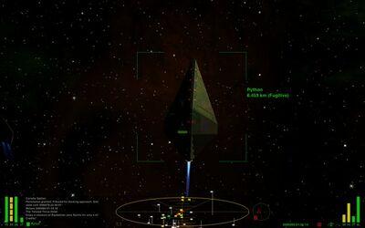
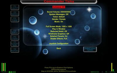
A simple HUD designed to be rationally organized, readable in every situation and to leave more unobstructed view possible. It works only on widescreens.
Contents
Overview
Features:
- Dashboard with black translucent background
- Messages and log windows integrated in the dashboard
- Persistent log screen
- Message and log windows, Scanner, compass and gauges have a supplementary background to enhance readability when facing the sun or other light sources
- Energy and Shields gauges have red translucent background for better readability
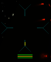
- Weapon temperature integrated in crosshair
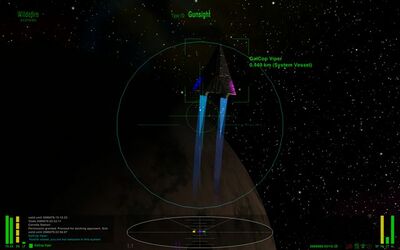
- Additional energy and shields gauges under the crosshair when in red alert
- Four modes
- in green condition the crosshair and scanner are dimmed
- in yellow condition the crosshair is cyan, and the scanner brighter
- in red condition the scanner is yellow/organge to reduce emphasis on non hostile ships and there are additional gauges to show energy/shields status under the crosshair
- when docked the message screen replaces the scanner which is hidden along with compass and log screen
Download
- You can download it here: https://app.box.com/s/8m0m4f3rxw1xwl2qcd1r
- Download for Sniper Sight for ClearHUD: https://app.box.com/s/uppkdo6xn0lurfxobt29
Author
Tichy (2012)
Changelog
Update 2012-12-01 (ver. 1.3-2)
- Tested with Oolite 1.77
- Better compatibility with Troomp.oxp when used with BGS.
Update 2012-11-23 (ver. 1.3-1)
- Fixed misplaced message screen at game startup
Update 2012-11-18 (ver. 1.3)
- From this version, the updating talkative space compass by spara is no longer included. At the moment, there are two similar enhancements Updating TSC by spara, and Detination ETA by wildeblood.
- New huds for red and docked conditions.
- Rearranged shields and energy gauges.
- Removed the additional energy/shielsd gauges from the yellow condition hud.
- Added Energy/shields gauges under the crosshair when in red condition.
- When docked, the message screen replaces the scanner
Update 2012-11-07 (ver 1.2.2)
- Talkative compass script updated with the new version from Aad-Hud.
Update 2012-11-03 (ver 1.2.1)
- Added a red background under energy and shields gauges, for better readability
- Changed the compass color to grey
- In yellow and red conditions, the scanner is brigther
- Slightly larger additional upper shileds and energy gauges
Update 2012-11-03 (ver 1.1-3)
- Moved the additional shields and energy gauges to the bottom.
- Compatibility with Sniper Sight (thanks to spara and Wildeblood).
Update 2012-10-29 (ver 1.1)
- Integrated cim and spara's Talkative space compass with distances and time calculation.
- Cyan crosshair when condition is yellow or red.
- Additional upper shields and energy indicators in yellow and red conditions. Useful when fighting, as we don't have to move the eyes to the extreme left side of the screen to see the shields and enegy state.
Update 2012-10-25:
- Persistent log screen
Update 2012-09-15:
- Contrast background behind all gauges, scanner and compass
- Fixed contrast background under log console
- Slightly bigger log font
- Small weapon temperature gauge integrated in the crosshair (now dark gray coloured)
- Clock moved under message window
- Darker and slightly smaller scanner
- Darker compass
- Target reticle disabled
- Overall better alignment of gauges, labels, message and log windows
License
Tichy's Licence for this HUD
"DO WHAT THE F*** YOU WANT TO" PUBLIC LICENSE
- Version 2, December 2004
Copyright (C) 2004 Sam Hocevar <sam@hocevar.net>
Everyone is permitted to copy and distribute verbatim or modified copies of this license document, and changing it is allowed as long as the name is changed.
- DO WHAT THE FUCK YOU WANT TO PUBLIC LICENSE
- TERMS AND CONDITIONS FOR COPYING, DISTRIBUTION AND MODIFICATION
0. You just DO WHAT THE F*** YOU WANT TO.
Licence for script
Author: spara (Mika Spåra) Talkative Space Compass by cim
This work is licensed under the Creative Commons Attribution-Noncommercial-Share Alike 3.0 Unported License. To view a copy of this license, visit http://creativecommons.org/licenses/by-nc-sa/3.0/
Tweaks
- Adds in 4 MFDs & other tweaks by Venator Dha (2014)
You may wish to consult How to tweak OXZ's


