Difference between revisions of "GETter HUD OXZ"
m |
m |
||
| Line 16: | Line 16: | ||
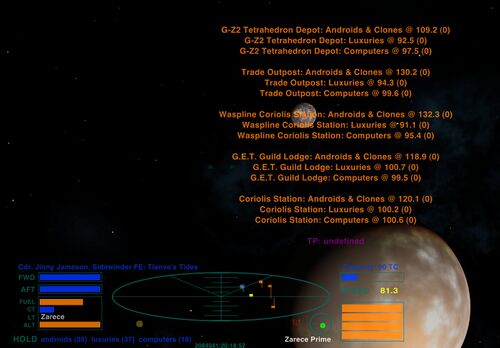
[[File:MZ-WP-Advisory-Zarece-1.jpg|thumb|right|500px|GETter HUD version 1.4, showing the much expanded comms message area (here, a [[Merchanter's Zeal OXZ|'''Merchanter's Zeal''']] witchpoint sell-advisory). Notice also the <b>name of the current system</b> occupying the LT bar.]] | [[File:MZ-WP-Advisory-Zarece-1.jpg|thumb|right|500px|GETter HUD version 1.4, showing the much expanded comms message area (here, a [[Merchanter's Zeal OXZ|'''Merchanter's Zeal''']] witchpoint sell-advisory). Notice also the <b>name of the current system</b> occupying the LT bar.]] | ||
* <u>Version 1.4</u>: | * <u>Version 1.4</u>: | ||
| − | ** Since the LT (laser temperature) bar is always black - if you're a merchanter - we thought it would be nice to fill that useless space with the < | + | ** Since the LT (laser temperature) bar is always black - if you're a merchanter - we thought it would be nice to fill that useless space with the <b>name of the current system</b>. |
** Both the comms log area's and the comms message area's height and width have been increased, making for fewer broken lines and more scroll-space for (trade advisory) lists at the witchpoint. | ** Both the comms log area's and the comms message area's height and width have been increased, making for fewer broken lines and more scroll-space for (trade advisory) lists at the witchpoint. | ||
** We've always felt that the automatic fading in and fading out of the <b>comms log</b> whenever a new message arrived was irritating to say the least. That 'feature' is now switched off: if you need to read the log, hit the 'log' key and hold it. | ** We've always felt that the automatic fading in and fading out of the <b>comms log</b> whenever a new message arrived was irritating to say the least. That 'feature' is now switched off: if you need to read the log, hit the 'log' key and hold it. | ||
Revision as of 09:00, 18 December 2022
Contents
FE Shipyards
FE Shipyards is pleased to bring you, our valued customer, the only HUD in the inventory made by Guilders for Guilders.
Our goals in designing the GETter HUD were quite simply to be quiet in tone, minimalist, unobtrusive, yet functional. It is a HUD eminently suited to peaceful trading rather than belligerence or deep space slaughter.
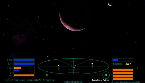
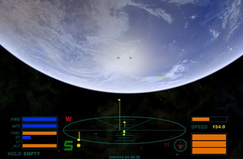
GETter HUD's most notable feature is the display of your vessel's hold contents, along with a digital velocity readout.
We expect our customer-base for this product to be running with weapons offline. Should you toggle weapons on, a large red "W" will illuminate at top left of the scanner, primarily as a reminder to toggle them off again.
Versions

- Version 1.4:
- Since the LT (laser temperature) bar is always black - if you're a merchanter - we thought it would be nice to fill that useless space with the name of the current system.
- Both the comms log area's and the comms message area's height and width have been increased, making for fewer broken lines and more scroll-space for (trade advisory) lists at the witchpoint.
- We've always felt that the automatic fading in and fading out of the comms log whenever a new message arrived was irritating to say the least. That 'feature' is now switched off: if you need to read the log, hit the 'log' key and hold it.
- Version 1.3: shipowner, ship class, ship name, and ship tonnage displayed in a deep blue line above the scanner. Hold contents now include goods quantity - also in deep blue. 'Mini-HUD' is now identical to the standard GETter HUD.
- Version 1.2: first stable release - re-colouring, with digital speed readout and hold contents displayed below the scanner.
Download
Version 1.2
In case you prefer the previous version, it will always remain available as an OXP here. Just unzip to Oolite->AddOns.
Version 1.4
Obtain your GETter HUD OXZ here or via Oolite's in-game Expansions Manager.
GETter HUD 1.4 OXZ download - the only HUD in the inventory designed by G.E.T. Brothers for G.E.T. Brothers, showing digital speed and cargo hold contents in place of missiles. BB thread
Quick Facts
| Version | Released | License | Features | Category | Author(s) | Feedback |
|---|---|---|---|---|---|---|
| 1.4 | 2022-12-18 | CC BY-NC-SA 4 | Enhances Trading | HUDs OXPs | Reval | BB-Link |


