Branding
Contents
Introduction
This page attempts to record and preserve the historical heritage of Elite/Oolite branding, specifically in terms of logos, icons and fonts. FrontierAstro is very useful in this regard.
Fonts came up from the OpenOffice documentation (Reference Sheet, etc.) that is distributed in PDF format. As soon as the PDFs were generated using open-source software only, it became apparent that the documents were based on fonts only available in Microsoft Windows operating systems. From that moment on, alternatives had to be found.
This page focuses on Elite (and its descendant Oolite) since (1) it is the origin of all the related brands, (2) and it has had a multitude of different versions, many of them introducing variations on the theme, while (3) the Frontier games do not seem to have had any significant brand-variations along the way. For completeness, though, the Frontier logos and icons will also be included, but Elite: Dangerous has an impractically-large amount of branding for the purposes of the simple historical-record intended here.
Elite branding history
1984... Elite... David Braben, Ian Bell, Robert Holdstock, and... Philip Castle.
The first three names were responsible for the programming and the documentation (Elite Players' Guide; The Space Trader's Flight Training Manual and The Dark Wheel, Stock Code Numbers for the latter: SBG38/B1 and SBG38/B3, respectively, etc.). However, the Elite simulator would probably not have had such a successful market-entrance had it not been for the fourth gentleman's eye-catching skills as an airbrush artist.
On the "FrontierAstro Elite - Various Items" page, approximately halfway down -- as if "quasi-chiastically" in the central focal-point of the nine topic-sections -- he is briefly introduced... but his work is pretty much everywhere on that page.
On Ian Bell's website, in the Elite Archives, in the file a4120001.png, the "DECEMBER 1984" Acorn News report (scan), in the second column, third paragraph; and in David Braben's 2013 reddit Elite: Dangerous AMA, Philip Castle is authoritatively identified as the designer of the original Elite logo. (The "Griffin thing", as mentioned by Braben, as a supposed element of the Elite logo, is debatable, though.)
Oolite branding history
> 7 April 2004, Aegidian's Oolite (progress) LiveJournal introduced the Oolite userpic, which can be downloaded from that page (right-click > Save Image As...) as a 100 pixels x 100 pixels .png image.
> 16:15, 3 January 2006, Rxke apparently uploaded to the Elite Wiki a 128 x 128 Oolite logo version of the userpic.
> 12:57, 7 May 2011, Ahruman uploaded to the Elite Wiki the 256 x 256 "New (2011) Oolite icon" by Eugene Chernyakov (seventh).
> Mon Oct 23, 2023 12:39 am, on the Oolite Bulletin Boards, in the Discussion forum, the "New splash screen and icon" thread was posted by phkb, in which was suggested that the Oolite splash screen and icon had been around for a while now, and it was proposed that they were about due for a refresh. This discussion led to the new, red versions of the 128 x 128 and 256 x 256 logo-images, and the new black-and-white version of the Oolite icon, all three uploaded to the Elite Wiki as new version of the old filenames six days later by Phkb. The new, red logo was also incorporated in the official oolite.space website.
Caveat & HowTo
The Elite Wiki allows the uploading of new versions of old files. However, "new version" should be defined and understood as "improved version", rather than "different version", where "improved" could mean "increased resolution", or "more universally-applicable file format", or other more subtle edits, in order to establish the originally-intended, best version of the file. Uploading a different version of an existing file causes that file to be replaced universally throughout the entire Elite Wiki -- even on old, "history" pages of Elite wikipages (e.g.: on the very first, 05:22, 14 February 2006 version of the Oolite Main Page the original, blue, 2006 logo had been replaced by the new, red, 2023 logo). This is not a black-and-white, easily-defined, well-behaved, simple and straight-forward issue, and there could, arguably, be many ambiguous scenarios and exceptions to whatever guidelines might have been imagined.
Therefore -- if in doubt -- it is safer, in terms of the preservation of the historical integrity of the Elite Wiki (although it also requires more work), to upload a "new" version of an existing file under a correspondingly-new filename with the intention of replacing the old version on subsequent (and not previous, historical) wikipages. When a "new" version of an existing file is considered for upload, the following methodology is recommended.
HowTo
On an ordinary Elite wikipage, in the left-hand margin, under "tools" > "Special pages" > "Media reports and uploads" > "File list", in the "Search for media name" search box, enter a known portion of the filename (e.g.: "logo" or "icon"), click the "Include old versions of files" tick-box and then the "Go" button; then click the name-hyperlink that is associated with the desired thumbnail. Then, again, in the left-hand margin, under "tools" > "What links here", in order to determine where on which wikipages which hyperlinks or references would potentially need to be updated to a new filename, so that history pages will not unintentionally be Minitrue-redacted.
Therefore, in an attempt (1) to prevent a loss of the commOonity's heritage on Elite Wiki history pages, and (2) to facilitate easier searching for older logo-versions, it is recommended that future, new-logo designs be named according to, and uploaded under filenames conforming to the established naming-scheme of "Oolite-logo#", where # is the next number in the sequence, and that all of the hyperlinks throughout the Elite wiki be updated accordingly. It is recommended that only a single, highest-resolution logo-image be uploaded, since the Elite Wiki has the functionality to scale the logo images: [[File:oolite-logo#.png|196px]]. A similar, numbered naming-scheme, although not implemented as yet, is also recommended for icons.
If an older logo (or icon) might be required for any purpose, the "logo" File list search-page is recommended (substitute "icon" in stead of "logo", if required). Include old versions of files.
Original Logos and Icons
Elite
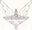
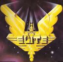
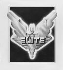
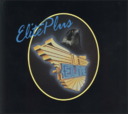
Elite logos have been sourced from box art, manual covers, half-title, title and other pages, and The Dark Wheel's front covers. It appears that other, minor media, included in any package, only have variations on the various themes in that package. The logos below are identified by, and arranged according to their dates and usage of first appearance. Hover over the images for descriptions. Consult FrontierAstro to see how some of these logos have been re-used for different elements of various versions.
Some logos were originally designed skew by a few degrees anticlockwise. The original, skew versions are available from the "logo" File list search-page. For ease of comparison, and for streamlining this page's layout, only the upright-rotated logos are shown here.
The 1991 ArcElite manual title-page and 1984 manual front-cover logos seem to be the cleanest, for the purposes of using them as potential templates for future designs.
From time to time, among the logos, there does seem to be a subtle motif of "ascending to the next level" (3D), "accelerating", and then also "breaking out of the frame" and "transcending of boundaries", as it were; c.f.: 1984 box art & The Dark Wheel front cover (even extending off-page), 1985 The Dark Wheel front cover, and 1988 manual front-cover. The graphics for the 1991 Elite Plus manual's title page, Cobra Mk III (p. 13), Observer's Guide to Ships in Service (pp. 67 - 86), and the Imprint novella's title page (p. "87"), all subtly communicate this repeated motif as well. In comparison with the other logos, and within itself, the 1991 Elite Plus simulator's logo also adds an extra, juxtaposed element of realism...
Oolite
Frontier (for completeness)
Logos and Icons on the Elite Wiki
Elite
2006
Wiki functionality is broken for me. I did what I could, to the best of my abilities, but I am apparently not capable/allowed to do what needs to be done here further anymore. Thanks. It's been fun, while it lasted. I'll leave this in the capable hands of other, more powerful people now.
Oolite
2006
2011
2023
Frontier (for completeness)
2006
Fonts
The font used in-game is a custom, mono-spaced font. Oolite does not work with Truetype or Freetype fonts.
The fonts in the documentation are ...
The fonts used in the website oolite.space are ...
The fonts used in the wiki are ...
The fonts used in the forum are ...
