Difference between revisions of "KeeperHUD"
From Elite Wiki
Cholmondely (talk | contribs) (Page Created (needs picture)) |
Cholmondely (talk | contribs) (Added screen shots) |
||
| Line 1: | Line 1: | ||
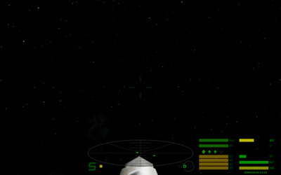
| + | [[File:KeeperHUD.png|thumb|right|400px|KeeperHUD with KeeperSky]] | ||
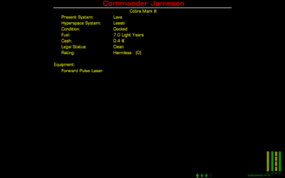
| + | [[File:KeeperHUD (Docked).png|thumb|right|400px|Docked HUD]] | ||
| + | |||
VERSION 1.2: | VERSION 1.2: | ||
Revision as of 19:53, 10 October 2021
VERSION 1.2:
- Increases number of MFDs from four to 15. When I first added Multi-Function Displays, they were a future feature of Oolite. Now that they're commonplace, four of them may not be enough. You may never need 15 displays on at once, but this does give you options in MFD placement.
- The MFD screens will change color depending on ship status. This is particularly useful when waiting to get out of masslock, as the crosshair and status light changes may not get your attention quite as much. For red status, I didn't use the standard "redColor" as that was too hard to read; I used a lighter red -- 1.0,0.3,0.3).
- Removed the joystick yaw/pitch/roll indicators. They're just commented out, so if you want to use them, you can uncomment the lines from the green, yellow and red hud files (just then make sure not to use MFD screen number 1, which is drawn in the same place).
- Moved the FPS indicator to the middle of the screen so if you turn it on it only will conflict with MFD #15 (for trunk build, probably MFD #14 as well). Anyone with trunk build, let me know if the smaller text that gets included with the FPS counter is still readable for you (or if it even really matters to you!).
VERSION 1.1: Adds new elements introduced in Oolite 1.79, including a new element that all HUDs must implement for compatibility with future OXPs.
- A permanent line indicating what equipment currently is primed.
- A line next to the compass with information about the current ASC target.
- Multi-function display screens for future OXPs that may use them (or the new Tutorial mode which already uses one of them).
I also better positioned the "Weapons systems offline" text which previously was a bit too far to the right.

