F C Textures
"How to Texture" by Flying Circus (2006)
Daniel Walker's Texturing Guide
(AKA: "There's more than one way to skin a Jabberwocky")
I'll skip over these early points, since they will probably be familiar to most people.
Step 1
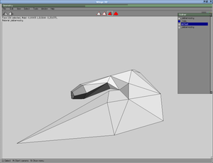
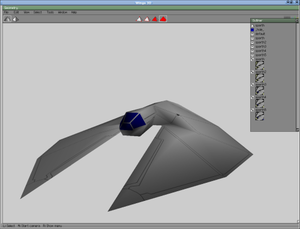
First, we load our ship:
This is the vessel known as the Jabberwocky, which I'll be reskinning to make more effective use of the texture-space by mirror planing the texture.
I'm going to reskin this ship up as a new variant Jabberwocky - called the "Sparth" - which will serve as a general high-performance interceptor/escort for those ships of the type that I tend to think of as the "Beyonder" ships (i.e. The Morrigan, Rosualt, Dioltach, Sceolan, Nemglan Class Carrier, and the Scathach, et cetera).
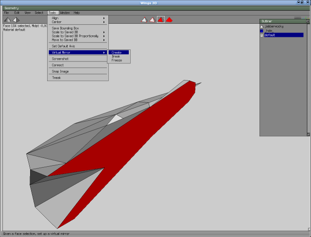
Delete half it's vertices, along the centreline and insert a mirror plane via Tools>Virtual Mirror>Create:
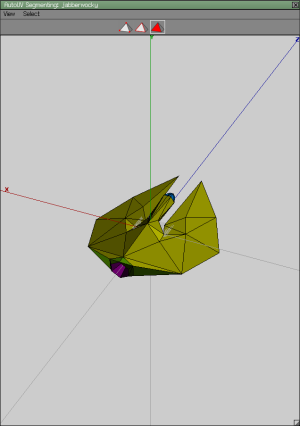
That will give you your old ship back - except that when you come to apply your UV map to it, you will find that you only need to actively assign textures to half of your ship's planes: the planes on the other half are automatically selected for you.
How you do this is your choice, but I'd advise you to avoid unnecessary work that will see you trying to marry-up details on adjacent texture areas. (As you'll see, a lot of my own designs are predicated upon my own efforts to avoid any of that kind of thing.)
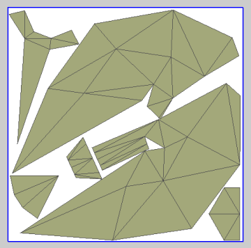
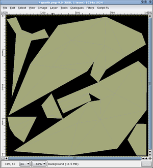
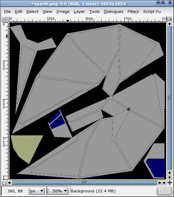
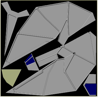
After I unfold, I shove my textures around and resize them a much as possible, to fill every available vacancy on the texture, while allowing me some elbow room to work. I create the textures at 1024x1024, and only resize down to 512x512 after I've finished every part of my texturing and testing of the ship. You may find this useful, as well: my 6 year-old Pentium III Linux box copes perfectly well with running the game with ships that have 1024x1024 textures in it.
To smarten up your work, you can grab vertices and move them around on the texture map. I had to do that with the main cabin stem, right in the middle of the picture, here, because it was overlaying the "wing" zone, which it is attached to.
For what it is worth, I also flattened the boundaries between cockpit canopy and cabin stem (tubes typically tend to unfold in curves, otherwise). You can do quite a bit of manipulation, prior to actually baking your texture, and it can save quite a bit of work later on. You can do this also by using cut-planes within a software package like Wings3D, but since you can read up on that online, and I didn't have time to include that here, we'll skip that bit, if we may :).
Step 2
Now export it and open your graphics package - I'm using the GIMP.
I find to best to treat texturing a model, as a process of gradual layering-on of new data until the final version is reached.
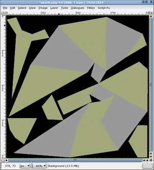
I tend to fill-in alternate zones of the ship's hull with the main body colour (mid grey, or #666666, in this case). This allows me to apply first-layer details to my greyed-out areas, while leaving me with enough visual clues as to the original boundaries between the adjacent zones, when it come to applying first-layer detail to the remaining areas, after I have I greyed-out those, in turn.
First-layer detail consists of boundary lines that run over the main areas of the ship. I follow the edges of the model quite closely, since in this case, this will allow me to put in "spines" between adjacent areas of detailing, at those edges where the plane of the ship's side changes sharply. This effectively fudges the issue of marrying up adjacent planes, while providing a visual impression of strength and purpose.
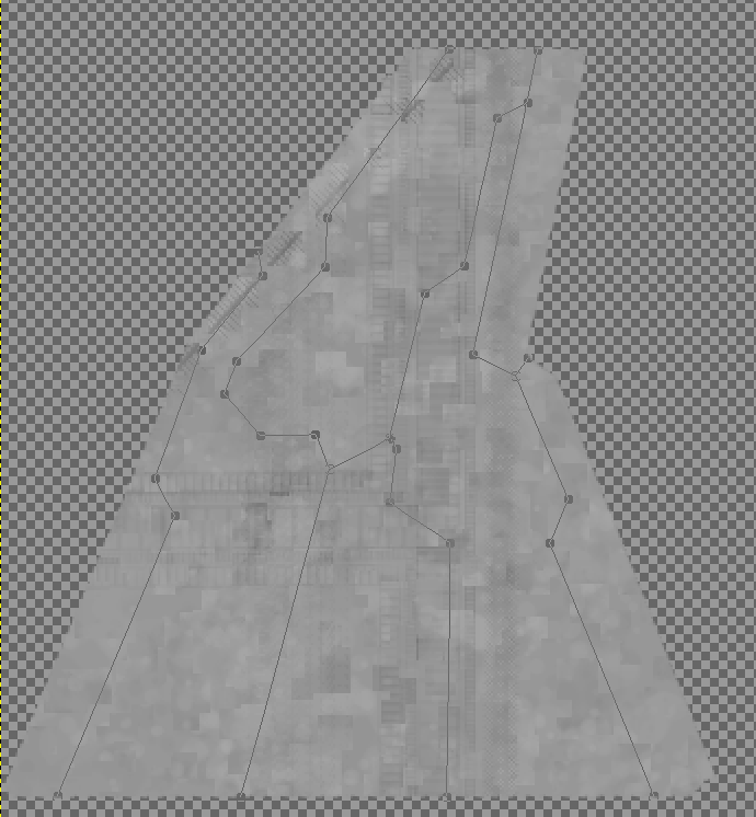
I use the "Paths" tool, to lay down the basic lines (see left).
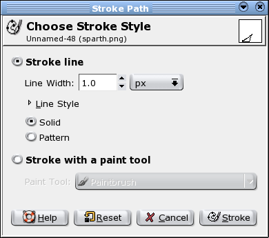
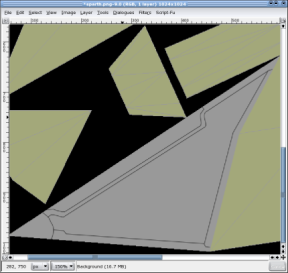
Now I use "Stroke Path" to apply a dark grey (#333333) 1 pixel wide line, over all of the paths I have just defined. You can use a paint tool, instead, if you wish, but I find a 1px line usually does the trick.
Here's the outcome of that:
Crawl all over the rest of the ship until layer1-detailing is finished.
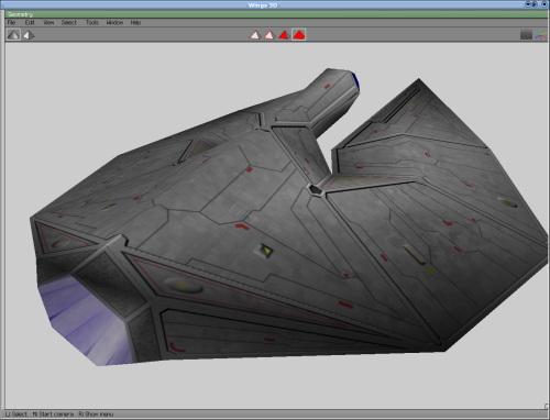
It may be worth taking a quick look in Wings or whatever 3D package you are using, to make sure all is well. You can fix things at this stage much more easily, than later on.
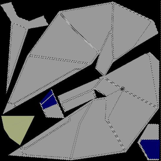
We're almost getting to the point where things get interesting! I use the "Contiguous areas" tool to select the main "spines" of my ship, and any other interesting details I want to add fake 3D detail to.
Step 3
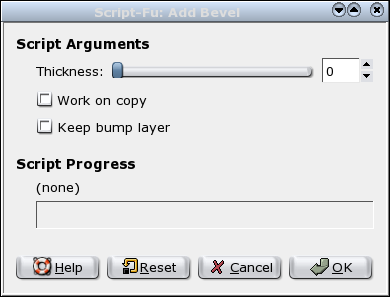
I now use one of the GIMP's Script utilities; the "Decor>Add Bevel" option. I uncheck "Work on copy" and actually specify a zero-depth bevel, since I want the bevelling to only be extremely slight:
This creates a 3D effect over the whole ship, leaving broad areas of flat texture (representing the main facets of the model) for me to add second level detail to:
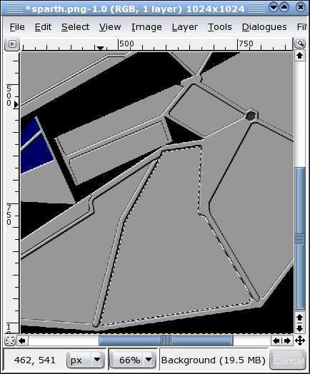
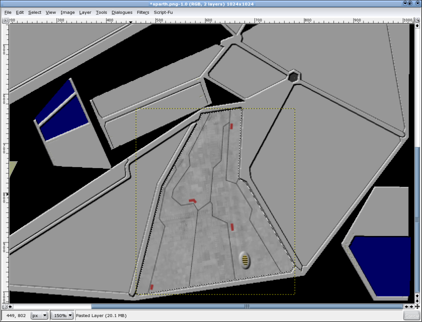
Now we add second level layers of detail to these facets. I'll choose that awkward-looking sod on the top face of the wing, to show you what I do next.
Select it using the "Contiguous areas" tool:
Now, I Copy it, and paste it as a completely new image - with a transparent background, because we started with a PNG, of course. That'll give us a nice clean area to work in, while I apply second-layer detail to it.
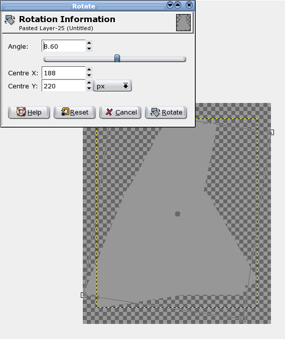
Because I like the second level detailing to follow at least one of the logical edges of the panel, I resize the canvas to allow for rotation, and then rotate the panel to where one of its sides is either horizontal or vertical, taking a note of how far (in degrees) I've rotated it by:
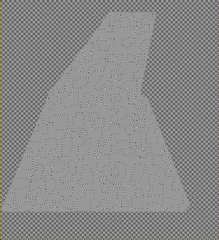
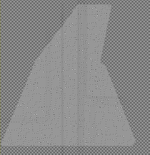
Now, holding down shift (to enable multiple selecting) smother the entire panel in tiny interlocking plate-like selections. It's easy to inadvertently double click and loose all your previous selections while doing this, but don't worry, you can Ctl-Z to get them back again, and then proceed on your way once more, by holding down shift again, and continuing to select squares. The final thing should look a bit like this:
Now the fun starts: dodge and burn! You can just start dodging and burning, right away, to create a general plated appearance, if you want, but I like to add a sub-layer of fake detail in, first, by doing what I call "twanging", with the burn tool, across the panel, at an opacity of about 10 or 12 percent.
You "twang", by clicking your burn tool down on one side of your panel - off in the transparent layer zone where no burning will actually occur. Now press down the "Shift" key and switch the cursor across to the other side of the panel: you should see a fine, elastic line follow your cursor about from where you first clicked with your mouse. Click again at any time, and the burn tool will go scudding across the surface of your panel from where you first clicked with your mouse, to meet your cursor, burnign a low-opacity track behind it as it does so, once every 20-30 pixels. If you are using a tool like the hollow square paintbrush, to burn with, a long track of square burns will be left behind.
Using "Select>Invert", your entire selection will be reversed, so that those areas outside of the interlocking square zones will now be selected. Repeatedly twanging, with a range of brushes, will provide a decent amount of second layer detail.
You could do this before laying on your interlocking select regions, of course - and on a ship like the Sparth, it probably makes no odds. On big ships, however, like the Nemglan, you can get close enough to them for it to become apparent that the twanged-on detail isn't contiguous with the individual "plates", but runs beneath them. It really looks better this way, in my opinion.
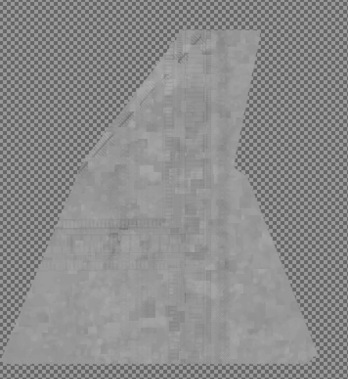
Now continue with a big, soft fluffy brush (such as "Sparks"), at very low opacity (say 3-4%). Use "Burn", and select "Shadows" and pass once over; select "Dodge"and select "Highlights" and pass once over the whole panel again; "Select>Invert", to invert the selected region, as before, and repeat the process... Hey presto - one groady-looking metal panel: Third-level detailing finished!
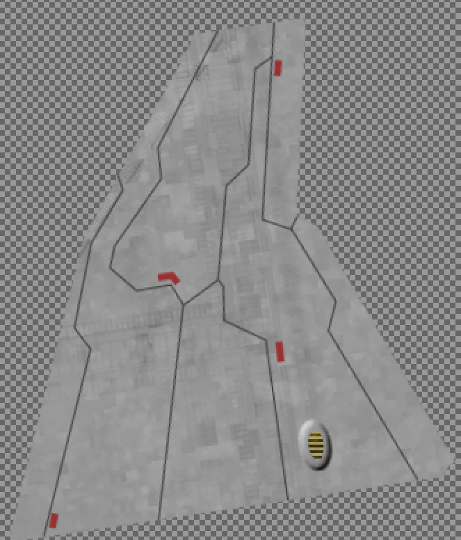
Now, I like to add in what I call "Aztec work": angular veins, that etch across the panels of the ship, implying that cables, or vital control lines, may lie beneath them. They give both, a mechanical, plus and almost organic, look to the ship (in my opinion, at least). This third-level layer of detail is applied using the paths tool, and a 1-pixel, dark grey "stroke paths" selection (just like before, with our first-level detail).
A few little tags and warning notices, applied in a dull red colour using short paths about 5 pixels wide, adds an extra bit of third-level detail. We're almost done with this panel, now!
Great, but it's still not attached to the ship... Now what? Well, you remember that rotation figure you took a note of earlier? We're going to reverse the rotation, back to the angle it was at before, by simply entering a minus value instead of a positive value. Bing!
Copy your entire panel image and go back to your ship texture. Paste the modified panel back into place over it's predecessor! "Kakun Pala!"
So there you have it. Continue panel-beating your way across the ship, panel by panel, taking each panel off and working on it and slapping the finished panel back in place (discard the old panel-images, after you've pasted each panel back in place, of course).
Final result
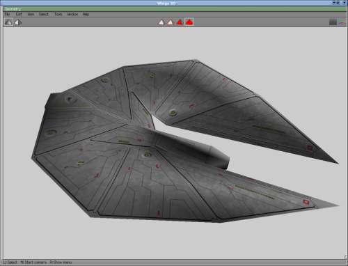
In about two hours, you'll have something like this - a fourth-level layered detail ship:
Notice that I've chosen to add odd spurious bits of fake 3D effect on some panels, too, using the "Decor>Add Bevel" script, on oval or rectangular selections, within the panels...
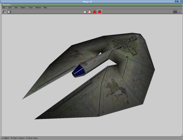
You may want to save this ship as your basic ship-blank, since fifth and sixth-level details simply consists of emblems and dirt:
When adding emblems, it may be useful to remember that, while a layer hovers, you can effectively make it transparent by running an eraser over it at less than 100% opacity (the underlying layer is unaffected, because it is not currently selected). This is very effective for creating semi-transparent or faded emblems like the horseman, above.
Links
- OXP howto texture
- OXP Tutorial
- How to create dockable stations
- List of software that is helpful for creating OXPs
- OXP Distribution for best practices on OXP packaging and distribution
Flying Circus created many of the early ship oxp's: the Snark, Bandersnatch, Jabberwocky, Morrigan, Llama and the "Beastie Goblin" Herald: "a beefed up System Vessel open to collaboration". See Oosat for the originals.
