Difference between revisions of "User talk:Gunney Plym"
Gunney Plym (talk | contribs) (New page: I played Elite on the BBC Model B many years ago, then on the Electron and a few other computers around at that time. Not many more recent games come close to the fun of Elite with it's c...) |
Gunney Plym (talk | contribs) |
||
| (9 intermediate revisions by the same user not shown) | |||
| Line 1: | Line 1: | ||
| − | + | == New G-HUD == | |
| − | + | [[Image:G-HUD_Mk2_resize.png]] | |
| + | [http://wiki.alioth.net/images/7/76/G-HUD_Mk2.png ''Large version of screenshot'']<br> | ||
| − | + | I have created a new HUD layout for the way I like to play. It's more combat centric, to my mind, with all the important stuff toward the center of the viewscreen. | |
| + | |||
| + | Shields are above the gunsight, speed to it's right and laser temperature to it's left. Either side of this are the Status indicators and further out the Station Space Indicators. Below the gunsight is the Missile Display. | ||
| + | |||
| + | The Scanner is somewhat larger than the default with Fuel, Altitude, Cabin Temperature, and Energy Gauges to it's left. The compass, with integrated Pitch and Roll, and the Fuel Scoop displays to it's right. | ||
| + | |||
| + | I've added the OXP and a screen shot to [[http://wiki.alioth.net/index.php/HUD_images_here ''HUD Images'']]. I still need to add it to the OXP List. | ||
| + | |||
| + | Some ideas were borrowed from the Klepto and MilSpec HUD's so kudos to their respective designers, as well as Cmdr. Maegil on the Bulletin Board for suggestions. Please feel free to critique :-) | ||
Latest revision as of 15:49, 8 July 2008
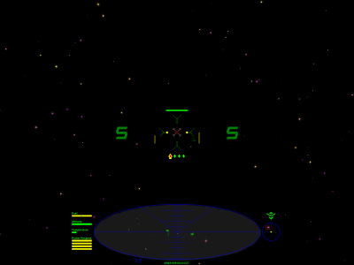
New G-HUD
I have created a new HUD layout for the way I like to play. It's more combat centric, to my mind, with all the important stuff toward the center of the viewscreen.
Shields are above the gunsight, speed to it's right and laser temperature to it's left. Either side of this are the Status indicators and further out the Station Space Indicators. Below the gunsight is the Missile Display.
The Scanner is somewhat larger than the default with Fuel, Altitude, Cabin Temperature, and Energy Gauges to it's left. The compass, with integrated Pitch and Roll, and the Fuel Scoop displays to it's right.
I've added the OXP and a screen shot to [HUD Images]. I still need to add it to the OXP List.
Some ideas were borrowed from the Klepto and MilSpec HUD's so kudos to their respective designers, as well as Cmdr. Maegil on the Bulletin Board for suggestions. Please feel free to critique :-)
