Difference between revisions of "Texturing tips and tricks by Theta Seven"
Theta Seven (talk | contribs) (Added as a follow-up to Smivs' tutorial. Images to be added after this.) |
Theta Seven (talk | contribs) (Added images.) |
||
| Line 7: | Line 7: | ||
===Before/After comparison=== | ===Before/After comparison=== | ||
| + | |||
| + | {| class="wikitable floatright" | ||
| + | |- | ||
| + | |[[File:Th7.TexturingTaT.01.before.png|150px]] | ||
| + | |[[File:Th7.TexturingTaT.02.after.png|150px]] | ||
| + | |} | ||
| + | |||
Texturing is hard. When I created my UV map, opened it in GIMP, and started painting, I realized that just coloring won't get me anywhere. The two images below show what details can do. The left one is the UV map I had when I started the process, the right is where I got. | Texturing is hard. When I created my UV map, opened it in GIMP, and started painting, I realized that just coloring won't get me anywhere. The two images below show what details can do. The left one is the UV map I had when I started the process, the right is where I got. | ||
| Line 15: | Line 22: | ||
==Metal Texture== | ==Metal Texture== | ||
| + | [[File:Th7.TexturingTaT.03.metal.png|150px|right]] | ||
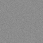
You can actually make a suitable metallic-looking texture in a couple of minutes: | You can actually make a suitable metallic-looking texture in a couple of minutes: | ||
| − | 1) Apply ''Hurl'' to a transparent background - Filters >> Noise >> Hurl - you can change the ''repeat'' level.<br/> | + | '''1)''' Apply ''Hurl'' to a transparent background - Filters >> Noise >> Hurl - you can change the ''repeat'' level.<br/> |
| − | 2) Apply ''Motion blur'' to the image - Filters >> Blur >> Motion blur - change the ''length'' and ''angle'' at your will.Then apply ''Motion blur'' in the other direction too - aka add 180° the angle - this is because sometimes, one edge will look off after a single motion blur - blurring in the other direction too will fix this. You can apply this as many times as you want with an angle you choose - I suggest changing the angle with about 75-90°, to make it look less linear.<br/> | + | '''2)''' Apply ''Motion blur'' to the image - Filters >> Blur >> Motion blur - change the ''length'' and ''angle'' at your will.Then apply ''Motion blur'' in the other direction too - aka add 180° the angle - this is because sometimes, one edge will look off after a single motion blur - blurring in the other direction too will fix this. You can apply this as many times as you want with an angle you choose - I suggest changing the angle with about 75-90°, to make it look less linear.<br/> |
| − | 3) ''Desaturate'' the image - Colors >> Desaturate - click OK.<br/> | + | '''3)''' ''Desaturate'' the image - Colors >> Desaturate - click OK.<br/> |
| − | 4) Add a layer below this, and paint it pure gray. | + | '''4)''' Add a layer below this, and paint it pure gray. |
The outcome will be something like the image on the right. | The outcome will be something like the image on the right. | ||
==Multiple Shades== | ==Multiple Shades== | ||
| + | {| class="wikitable floatright" | ||
| + | |- | ||
| + | |[[File:Th7.TexturingTaT.04.rectangles.png|150px]] | ||
| + | |[[File:Th7.TexturingTaT.05.overlay.png|150px]] | ||
| + | |} | ||
To make a texture look more realistic, simple colors should have different shades, like some parts of the texture are slightly dirty: | To make a texture look more realistic, simple colors should have different shades, like some parts of the texture are slightly dirty: | ||
| − | 1) Create a layer of light-gray rectangles on a transparent background - use the rectangle select (try Shift while selecting) and the bucket fill tool. Make them vary in shape and size, and have some overlap each other, like in the image on the right.<br/> | + | '''1)''' Create a layer of light-gray rectangles on a transparent background - use the rectangle select (try Shift while selecting) and the bucket fill tool. Make them vary in shape and size, and have some overlap each other, like in the image on the right.<br/> |
| − | 2) Create a layer above this with dark-gray rectangles.<br/> | + | '''2)''' Create a layer above this with dark-gray rectangles.<br/> |
| − | 3) Merge layers - right-click on a layer on the right, and select ''Merge visible layers''.<br/> | + | '''3)''' Merge layers - right-click on a layer on the right, and select ''Merge visible layers''.<br/> |
| − | 4) Apply ''Gaussian Blur'' - Filters >> Blur >> Gaussian Blur - raise the radius at your will.<br/> | + | '''4)''' Apply ''Gaussian Blur'' - Filters >> Blur >> Gaussian Blur - raise the radius at your will.<br/> |
| − | 5) Add this image as a layer to your texture, and on the right, above the ''Opacity'' bar, set the ''Mode'' of the layer to ''Overlay''. It will add a subtle change in shades to the layers below it. | + | '''5)''' Add this image as a layer to your texture, and on the right, above the ''Opacity'' bar, set the ''Mode'' of the layer to ''Overlay''. It will add a subtle change in shades to the layers below it. |
==Metal Plating== | ==Metal Plating== | ||
| + | |||
| + | {| class="wikitable floatright" | ||
| + | |- | ||
| + | |[[File:Th7.TexturingTaT.06.plating.png|150px]] | ||
| + | |[[File:Th7.TexturingTaT.07.line1.png|150px]] | ||
| + | |[[File:Th7.TexturingTaT.08.line2.png|150px]] | ||
| + | |} | ||
| + | |||
One of the most convincing detail on a texture can be metal plating: | One of the most convincing detail on a texture can be metal plating: | ||
| − | 1) Create a new layer above your texture.<br/> | + | '''1)''' Create a new layer above your texture.<br/> |
| − | 2) With a 075 hardness brush, and using Shift-click, paint along the edges of the sides of your model in black. At the seams (cuts) of your texture, have the middle of the line on the seam.<br/> | + | '''2)''' With a 075 hardness brush, and using Shift-click, paint along the edges of the sides of your model in black. At the seams (cuts) of your texture, have the middle of the line on the seam.<br/> |
| − | 3) With a bit smaller eraser, choose 025 hardness, and using Shift-click, erase the inner part of the line. | + | '''3)''' With a bit smaller eraser, choose 025 hardness, and using Shift-click, erase the inner part of the line. |
And that's it. It might look silly at first, but do this for each line, and you'll have an amazing plating-edge. | And that's it. It might look silly at first, but do this for each line, and you'll have an amazing plating-edge. | ||
| − | 4) Decrease the plating layer's opacity to ~40%. This is so the plating won't look off. | + | '''4)''' Decrease the plating layer's opacity to ~40%. This is so the plating won't look off. |
==Rust-effect== | ==Rust-effect== | ||
| + | |||
| + | {| class="wikitable floatright" | ||
| + | |- | ||
| + | |[[File:Th7.TexturingTaT.09.pre-rust.png|150px]] | ||
| + | |[[File:Th7.TexturingTaT.11.rustmaking.png|150px]] | ||
| + | |[[File:Th7.TexturingTaT.10.post-rust.png|150px]] | ||
| + | |} | ||
| + | |||
Rust adds that last level of detail needed to the texture. | Rust adds that last level of detail needed to the texture. | ||
| − | 1) Add a new layer, and paint it to the color you want as your rust (you can also create a texture using multiple shades).<br/> | + | '''1)''' Add a new layer, and paint it to the color you want as your rust (you can also create a texture using multiple shades).<br/> |
| − | 2) Right-click the layer on the right, and select ''Add layer mask''. Choose ''Black - full transparency''. | + | '''2)''' Right-click the layer on the right, and select ''Add layer mask''. Choose ''Black - full transparency''. |
Now you see that the rust-layer has disappeared, and the layer on the right now has two thumbnail images - one for your rust, and one black. The black one should also be highlighted in white. Any changes you make on this layer will apply to the highlighted part.<br/> | Now you see that the rust-layer has disappeared, and the layer on the right now has two thumbnail images - one for your rust, and one black. The black one should also be highlighted in white. Any changes you make on this layer will apply to the highlighted part.<br/> | ||
What this does is that it will show your layer completely at white pixels of the mask, and hide it completely at black ones. Shades of gray will show the layer partially transparent. And this is what we need. | What this does is that it will show your layer completely at white pixels of the mask, and hide it completely at black ones. Shades of gray will show the layer partially transparent. And this is what we need. | ||
| − | 3) Choose eraser, set the hardness it uses to ''Grass'' or something like it, raise the size so you'll be able to go through the whole texture fast, and decrease the brush opacity to ~25% or less. | + | '''3)''' Choose eraser, set the hardness it uses to ''Grass'' or something like it, raise the size so you'll be able to go through the whole texture fast, and decrease the brush opacity to ~25% or less.<br/> |
| + | '''4)''' And paint through the texture. This is the most resource-intensive step in the whole tutorial, so it might take a while... | ||
| − | Obviously, the example below is not that nice - if you have multiple main colors, have a rust layer for each color, only having rust-texture over the respective areas, and change the rust colors to match that of the texture color. (Check the second image on the page to see how rust looks with proper colors) | + | And it's finished. Obviously, the example below is not that nice - if you have multiple main colors, have a rust layer for each color, only having rust-texture over the respective areas, and change the rust colors to match that of the texture color. (Check the second image on the page to see how rust looks with proper colors) |
Revision as of 10:20, 25 March 2017
Contents
Introduction
The following page will cover some of the most useful tips and tricks regarding texturing Oolite models. I can't say that these are the best ways to do these, but they are relatively simple with good-looking outcomes. The reason for this page is that I didn't find anything like this on the wiki, and with the new textures introduced in v1.80, some more work is needed for up-to-par textures than before.
I, as many others, started making OXZs with limited knowledge about texturing, modelling and coding, and found the necessary information regarding these from other tutorials on the wiki. Before going on, I assume that you have read the OXP howto page, as well as the other howto pages it links to, especially Smivs' texture tutorial. I try to extend that tutorial, showing some more tricks.
I will use GIMP for texturing, and my own OXZ ship, the TAU Rockhopper for visualizing examples.
Before/After comparison
|
|
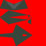
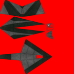
Texturing is hard. When I created my UV map, opened it in GIMP, and started painting, I realized that just coloring won't get me anywhere. The two images below show what details can do. The left one is the UV map I had when I started the process, the right is where I got.
Important tips
- Use layers. Really. This is the top rule.
- Have your UV map as the bottom layer. That way, you'll see the edges in your model. If you paint on a layer above it, but you forgot where an edge was, change the layer's opacity to something like 60% (The Opacity bar in the top right), so you'll see the outline below your design.
- Take your time. Don't expect to be done with this in a day. I gradually advanced with this, adding a detail a day.
Metal Texture
You can actually make a suitable metallic-looking texture in a couple of minutes:
1) Apply Hurl to a transparent background - Filters >> Noise >> Hurl - you can change the repeat level.
2) Apply Motion blur to the image - Filters >> Blur >> Motion blur - change the length and angle at your will.Then apply Motion blur in the other direction too - aka add 180° the angle - this is because sometimes, one edge will look off after a single motion blur - blurring in the other direction too will fix this. You can apply this as many times as you want with an angle you choose - I suggest changing the angle with about 75-90°, to make it look less linear.
3) Desaturate the image - Colors >> Desaturate - click OK.
4) Add a layer below this, and paint it pure gray.
The outcome will be something like the image on the right.
Multiple Shades
|
|
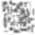
To make a texture look more realistic, simple colors should have different shades, like some parts of the texture are slightly dirty:
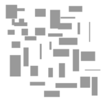
1) Create a layer of light-gray rectangles on a transparent background - use the rectangle select (try Shift while selecting) and the bucket fill tool. Make them vary in shape and size, and have some overlap each other, like in the image on the right.
2) Create a layer above this with dark-gray rectangles.
3) Merge layers - right-click on a layer on the right, and select Merge visible layers.
4) Apply Gaussian Blur - Filters >> Blur >> Gaussian Blur - raise the radius at your will.
5) Add this image as a layer to your texture, and on the right, above the Opacity bar, set the Mode of the layer to Overlay. It will add a subtle change in shades to the layers below it.
Metal Plating
|
|
|
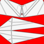
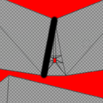
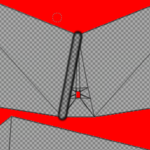
One of the most convincing detail on a texture can be metal plating:
1) Create a new layer above your texture.
2) With a 075 hardness brush, and using Shift-click, paint along the edges of the sides of your model in black. At the seams (cuts) of your texture, have the middle of the line on the seam.
3) With a bit smaller eraser, choose 025 hardness, and using Shift-click, erase the inner part of the line.
And that's it. It might look silly at first, but do this for each line, and you'll have an amazing plating-edge.
4) Decrease the plating layer's opacity to ~40%. This is so the plating won't look off.
Rust-effect
|
|
|
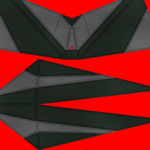
Rust adds that last level of detail needed to the texture.
1) Add a new layer, and paint it to the color you want as your rust (you can also create a texture using multiple shades).
2) Right-click the layer on the right, and select Add layer mask. Choose Black - full transparency.
Now you see that the rust-layer has disappeared, and the layer on the right now has two thumbnail images - one for your rust, and one black. The black one should also be highlighted in white. Any changes you make on this layer will apply to the highlighted part.
What this does is that it will show your layer completely at white pixels of the mask, and hide it completely at black ones. Shades of gray will show the layer partially transparent. And this is what we need.
3) Choose eraser, set the hardness it uses to Grass or something like it, raise the size so you'll be able to go through the whole texture fast, and decrease the brush opacity to ~25% or less.
4) And paint through the texture. This is the most resource-intensive step in the whole tutorial, so it might take a while...
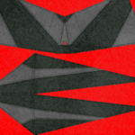
And it's finished. Obviously, the example below is not that nice - if you have multiple main colors, have a rust layer for each color, only having rust-texture over the respective areas, and change the rust colors to match that of the texture color. (Check the second image on the page to see how rust looks with proper colors)
These are the most important methods I used, making a made-in-MS-paint texture to a texture worthy of being on a spaceship. I hope at least some of them proved useful. Good luck with designing!
