Smivs' texture tutorial
Smivs' Guide to making Textures
Before I start I should point out that I have had no formal art or graphic-design training. What I will explain below is my personal method of preparing textures for Oolite, based on what I've learnt largely by researching on the 'net, Trial-and-Error and sometimes with some advice from people who do know what they are doing. There are almost certainly other, perhaps better ways of doing this, but this works for me. I suggest using images of 2048x2048px when preparing textures as this will allow a high level of detail. Oolite textures can be 512x512px, 1024x1024px or 2048x2048px. If you are working on an OXP for release, keep in mind some computers won't be able to handle lots of large textures, so you may choose to scale your textures down for release or produce more than one version, employing different texture sizes for each.
As I use Gimp, this tutorial refers to this software, but other image manipulation software will work in a similar way. For this Tutorial, we'll re-skin a Python. The images can be expanded by clicking on them.
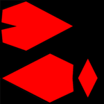
Step one is to give your ship a basic texture. You could just colour the ship (grey or whatever colour you want), but I use a metal-plate finish which I pre-prepare. The way to do this is to firstly make a transparency of the silhouette of your ship. If you are re-skinning an existing ship, take the existing Texture, or if it is a new ship you have designed your 3D modelling software will present you with a diffuse_map with a silhouette of your ship on a coloured background. For this Tutorial I have used the in-built Python texture from Oolite. I make the ship one colour and the background another, usually red and black. Just go round the edges of the silhouette carefully in red, then bucket-fill the 'ship' part in red. Bucket-fill the background in black.
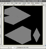
You can then make the red (ship) bits transparent. Open the texture in Gimp, then click on 'Layer', 'Transparency', 'Add Alpha Channel' (if this option is unavailable you might need to remove an existing Alpha Channel first, then add one again.), Right-click and 'Select By Color'. Hover the cursor over the red/ship and left click. Then right-click and 'Edit', 'Clear'. This should make the 'ship' part transparent - Gimp shows this as a grey check pattern.
Save this to the desktop as a .png file. Next we need to add a background texture. I favour a metal-plate finish for realism. To make this is a right pain in the Iron-Ass so here's one you can download and use.
Metal-plate background texture
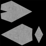
Next, open this background texture, and drag and drop the transparent silhouette onto it. This will give you the silhouette with the metal-plate finish.
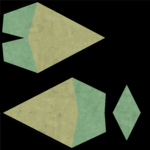
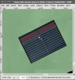
Now we get to the interesting bit...adding colour and detailing. Colour first. If you just want the whole ship one colour, bucket-fill the image using an opacity of between 15% and 30%. This will allow the metal-plate finish to show through. Because you are applying the colour to a grey background this has the effect of darkening the colour, so you can get away with quite bright colours. Experiment a bit and you'll soon see how it works. If you only want parts of the ship coloured, or different colours on different parts of the ship, you will need to mark off the areas you want to colour. The standard Python is green with a brown/yellow tail, so let's reverse that colour scheme. Using the smallest pencil and Black, draw dividing lines on your texture like in this image (left). It is a good idea to check they are in the right position before going any further, so we need to apply the texture to a ship, launch it and have a look. There are several ways to do this such as spawning ships into the Game. My prefered method is to use a hacked save file and what amounts to a mini-OXP for the ship. This makes it possible to launch it, fly it around and look at it from all angles using the external views. There is a brief description of how to do this at the end of this Tutorial.
If the guide lines are not in the right position you can correct these at this point. When you are happy all is well, bucket-fill the colours as above. If the bucket-fill overspills and colours the whole image, there is likely to be a 'hole' somewhere in your guide lines so go back and check, expanding the image if necessary ('View', 'Zoom'). If coverage is patchy, try adjusting the 'threshold' in the bucket-fill dialogue, but a bit of patchy-ness can give a nice 'worn' look to your ship. For a professional finish, go over the guidelines with colour to remove the black edges. As these are normally only 1 pixel wide, a solid colour will normally not notice and covers up the black quite nicely.
Once you have your basic colours, we can then start adding detailing such as Cockpits, Louvres, etc. You can draw these, or 'borrow' images from the internet - crop little bits out of photos etc. Be aware that many images on the net are subject to copyright, but (and remember I didn't suggest this!) cropping a pair of adjacent windows from a photo of a skyscraper to use as Cockpit Windows is unlikely to bother anyone. If the image is square or rectangular, just crop it accurately, and if it's a different shape, crop as well as you can, make all the bits you don't want a strong primary colour (one that doesn't appear in the image), and make the 'unwanted' bits transparent as described above. I usually arrange these on the desktop so they are ready to use. These details can then be dragged and dropped onto the base texture, and moved around using 'Rotate' (shift-r) and 'Move' (m). To rotate, specify the rotation in the dialogue box or hold the Cursor over the image, hold down the left mouse button and turn it by gentle movement of the mouse. Click 'Rotate' in the dialogue box to apply the rotation. Moving is much the same - just 'drag' it.
You might need to re-size these depending on your ship. This is easy...open the image in Gimp, 'Image', 'Scale Image', specify the size and save as a .png file. If you change the width the height will automatically change to suit, but you can 'unlock' by clicking on the chain-link thingy and vary the width and height independently.
To keep this simple, we'll add a cockpit, a hatch, some portholes and some louvres to our Python. For simplicity I'll just do one side of the ship in this Tutorial.
Drag and drop each of your prepared 'details' onto the base texture, and position them by Moving and Rotating. In Gimp each time you 'drop' a new image, a new 'layer' is added. Layers can seem complicated at first but they are your friend. Open the Layers dialogue box (Shift L) and you will see each layer displayed in a column. You can move them up or down relative to each other ('Layer', 'Stack') and switch them on and off by clicking on the 'Eye' symbol.
In this screen-shot we can see the background with the colours and the detailing added. To the right bottom is the layers dialogue box showing the layers in the order we added them, first the hatch, then the cockpit, then the louvres. You will notice this is highlighted in the dialogue box as the 'active' layer, and the louvre has a 'box' around it on the image.
To check everything is OK, save the image as a .png (Oolite textures are .png files) but DON'T close Gimp, load the .png into the game (either by using my 'Save/OXP' method or any other way you prefer) and take a look. If anything is not right, go back to Gimp and correct the problem. Remember you can select any layer and change things, move them, rotate them till it's right.
If at any point you need to close Gimp, save the image as a .xcf file which will preserve all the layering information...the next time you load it into Gimp, all the seperate layers will still be there as seperate layers. Always do this before closing Gimp.
You can then continue to repeat these steps to add other features (an Engine Exhaust might be nice!) until you have finished adding all the detailing.
Now, let's move on to the Emission_map, the bit that gives you the nice lighting effects. We'll illuminate the cockpit, add some glow to the louvres, add a few portholes and have a spotlight illuminating the hatch. Emission maps use a black background which might seem a bit odd, but Black is effectively transparent on an emission map.
We can re-use the cockpit layer so that's already in place, so let's add some glow to the louvres next. Go back to (or re-open) your .xcf file. Add a new layer ('Layer', 'New Layer') and call it something like 'Glow'. Zoom in on the image ('View', 'Zoom') so that the louvres are nice and big, and using a darkish red colour, draw 1px lines 'between' the louvres. For the portholes, start another new layer and apply these...white spots are as good as anything, using the second or third size pencil.
We will do the spotlight in a minute, but we are now ready to make the final diffuse_map and the first level of the emission map. To get a good lighting effect from the emission map we also want most of these elements on the diffuse_map, so by clicking on the 'Eyes' switch off the 'glow' (layer 5 in this case - see image to right). Having the other emissive elements (cockpit and portholes in this case) on both the diffuse_map and the emission_map will make them nice and bright, but the 'glow' needs to be darker and more subtle, so that will just be on the emission_map as you'll see.
This should complete your diffuse_map, but there is one more step to take. If you are using lots of textures or very large textures in your OXP, it is important to keep file sizes as low as possible to keep the download small. For a straight-forward diffuse map like the one we have made, firstly click on 'Layers' and go down to 'Transparency'. Click on 'Remove Alpha Channel'. This will remove a lot of un-needed data. Then click on 'Image', 'Mode' and 'Index'. You will see a conversion box, and just click on 'Convert'. This reduces the palette to 256 colours from the thousands that the RGB image we created has. For most Oolite textures this makes no difference to the 'look' of the image but again reduces the data considerably. The end result is an image which should look the same, but is only about a third the file-size of the original. However, if your texture uses lots of colour gradients and fades this process may cause noticeable pixelation and in this case an alternative form of compression may be needed. If you are not sure, the best thing to do is make a copy of your image and try it and see. Assuming your image is OK save this as 'yourship_diffuse_map.png', and move it into the textures folder.
Now we need to make the first of two parts of the emission_map. Switch off everything that won't be part of the emission_map (louvres, cargohatch and background). This will give you a transparancy with the cockpit, glow and portholes on it. Add a new layer, in this example called BG (background) and bucket-fill with black. Don't be alarmed when it seems to paint over the emissive elements. Go to 'Layer', 'Stack' and 'Layer to Bottom'. This moves the black BG layer to the bottom with the emissive elements visible on top. Save this as a .png (I usually call it 'lights.png')
Next we want to add a spotlight to illuminate the hatch. Again these can be hard to make, so here is one you can use.
You might need to re-size this depending on your ship following the instructions given above.
Make sure the ship texture is visible, and drag and drop the lightbeam image onto your texture and move it into position using Move and Rotate ('m' and 'Shift-r'). You might need to 'Layer', 'Stack', 'Layer to Top' to be able to see it. If it helps to align it, switch it on and off rapidly by clicking on the 'Eye' and check it is positioned correctly, illuminating the part/s of the ship you want. Once you are happy it's OK, switch off everything except the black BG we used earlier, and the lightbeam. Save this as a .png file - call this something like 'spotlights.png'.
At this stage I would strongly suggest saving the whole thing as a .xcf file - call it 'yourship_master_image.xcf' or something like that. Once that is done you can close Gimp.
We can now make our emission_map. We need to combine the two emissive images, but with different modes to get the desired effect - we want the spotlight to light the hatch but in a way that varies with ambient light falling on it, but we want the cockpit, portholes and 'glow' to be consistantly bright. Open 'spotlights.png' in Gimp and set the Mode to 'Multiply'. Drag and drop the 'lights.png' onto this. At this stage this will make the spotlight disappear, but that's OK. Set the Mode to 'Lighten Only' and the spotlight element will re-appear. You might want to add some white spots to the 'source' of the spotlights at this stage to give the impression of a bright light source. Go to 'Layer', 'Merge Down'. This will merge the image into one layer but it will retain the Modes we set earlier. For emission maps, it is necessary to leave the alpha channel in place, and they should not be indexed. Save as a .png and you have your emission_map. Call it 'yourship_emission_map.png' and move it into the textures folder.
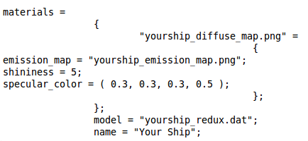
That's all the artwork done. To get it all working you will need to add the relevant information into the .dat model file and the shipdata.plist file in the Config folder. The ship's texture name ('yourship_diffuse_map.png') should be specified in the model (.dat) file, and you will need to add 'Materials' attributes to the shipdata.plist file:-
Where the 'shininess' and 'specular-color' give a mild degree of shininess and a gentle reflectiveness of white light. These settings will look natural, but can be changed if needed.
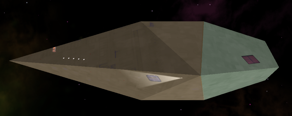
And this is what our Python looks like in-game.
For any questions, there is a discussion thread on the Oolite Forum here
How to make your ship the 'Player Ship' so you can check it using the External Views
Hack a Save File:
Start a New Game, and save it as 'Checker'. Open the Checker.oolite-save in an approriate text editor (NOT Notepad!!!) and then scroll about half way down and find:-
   <key>ship_desc</key>
   <string>cobra3-player</string>
   <key>ship_kills</key>
   <integer>0</integer>
   <key>ship_name</key>
   <string>Cobra Mark III</string>
Change the 'ship_desc' (cobra3-player) to "your_ship_name-player" Change the 'ship_name' (Cobra Mark III) to your ship's name.
Save this and move it into your 'oolite-saves' folder.
Make a mini-OXP:
Create a folder and call it "Shipchecker.oxp". Inside this folder create another called 'Config'. Inside 'Config' place a file called 'shipdata.plist'. To make the shipdata.plist, copy the section dealing with the Mk 3 Cobra player from the main Oolite shipdata.plist. Replace all the parts specifically referring to the Cobra with your Ship's details, and add the 'Materials' section as above. You will need to add curly brackets top and bottom, '{' at the top and '}' at the bottom. Create a second folder within "Shipchecker.oxp" and call it 'Textures'. This is where your diffuse_map and emission_map go. Save it all, and move the "Shipchecker.oxp" into your 'AddOns' folder.
When you start the game, hold down 'Shift' until you see the spinning Cobra, load 'Commander Checker' and you should be good to go.
External links
- List of software that is helpful for creating OXPs
- OXP Distribution for best practices on OXP packaging and distribution
- OXP Tutorial
